YMCA Rebrand
Role: Illustrator, Editorial, & Graphic Designer
Tools: Adobe InDesign, Adobe Illustrator, & Adobe Photoshop
Duration: January 2022 – April 2022
The main purpose of this YMCA Rebrand is to showcase the YMCA organization in a more accurate and purposeful manner. This rebrand concept is comprised of an updated logo, fluid elements, stationery, and promotional material.
Logo Concept & Redesign
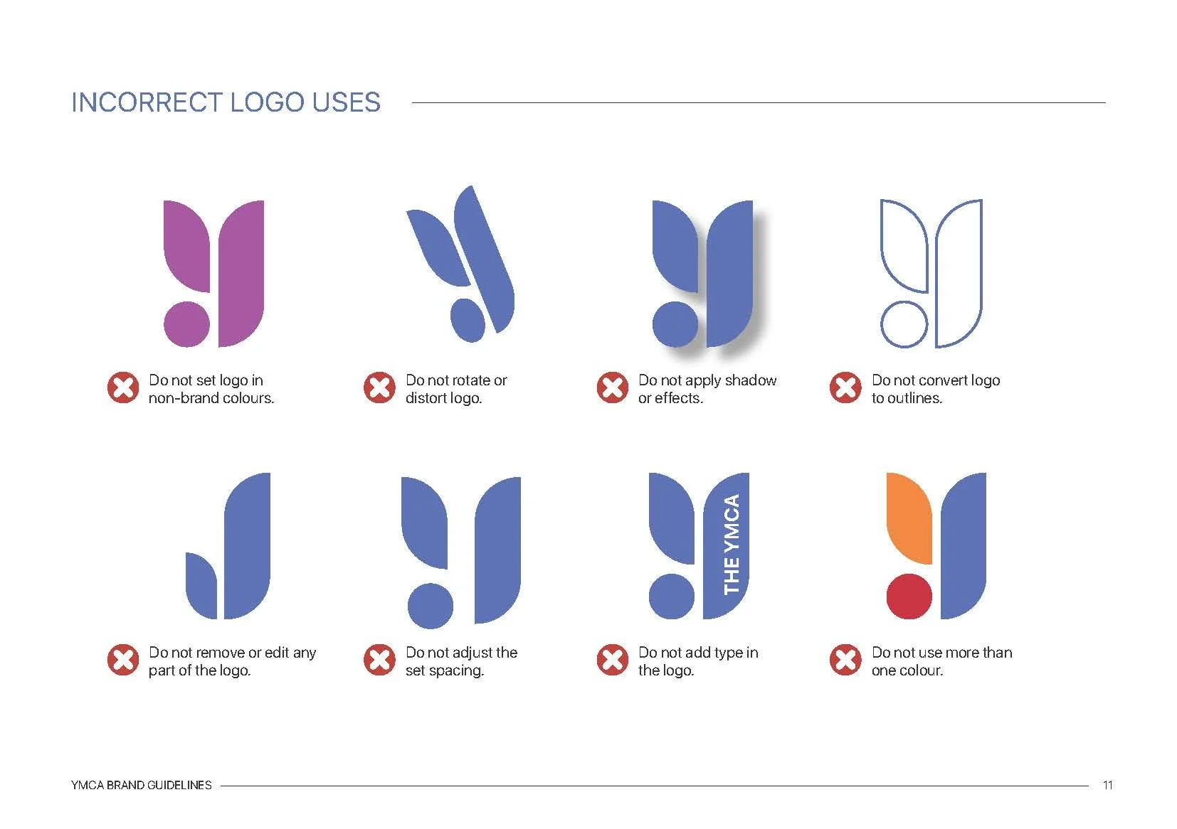
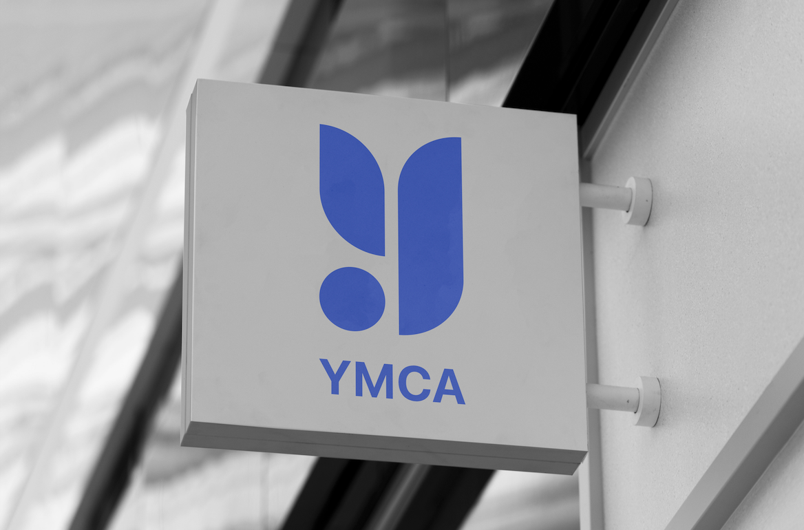
The idea behind this redesigned logo focuses on the resourcefulness and welcoming ambience of the YMCA. In this new logo concept, the letter “Y” is separated into three shapes that represents the “Mind, Body, & Spirit” of YMCA members. The circle resembles the mind and the interconnectedness of the community. The upper left shape resembles a “wing” to represent the spirit and the right shape represents the body. These shapes are separated by equal spacing or “paths” to represent the unique journeys of YMCA members. Whether their journey began with fitness, support, or education, all members are led to the peak of the “Y” as they will be embarking on new journeys by joining the YMCA.
YMCA Proposed Logo Design
YMCA Outdoor Logo Signage
Fluid Elements
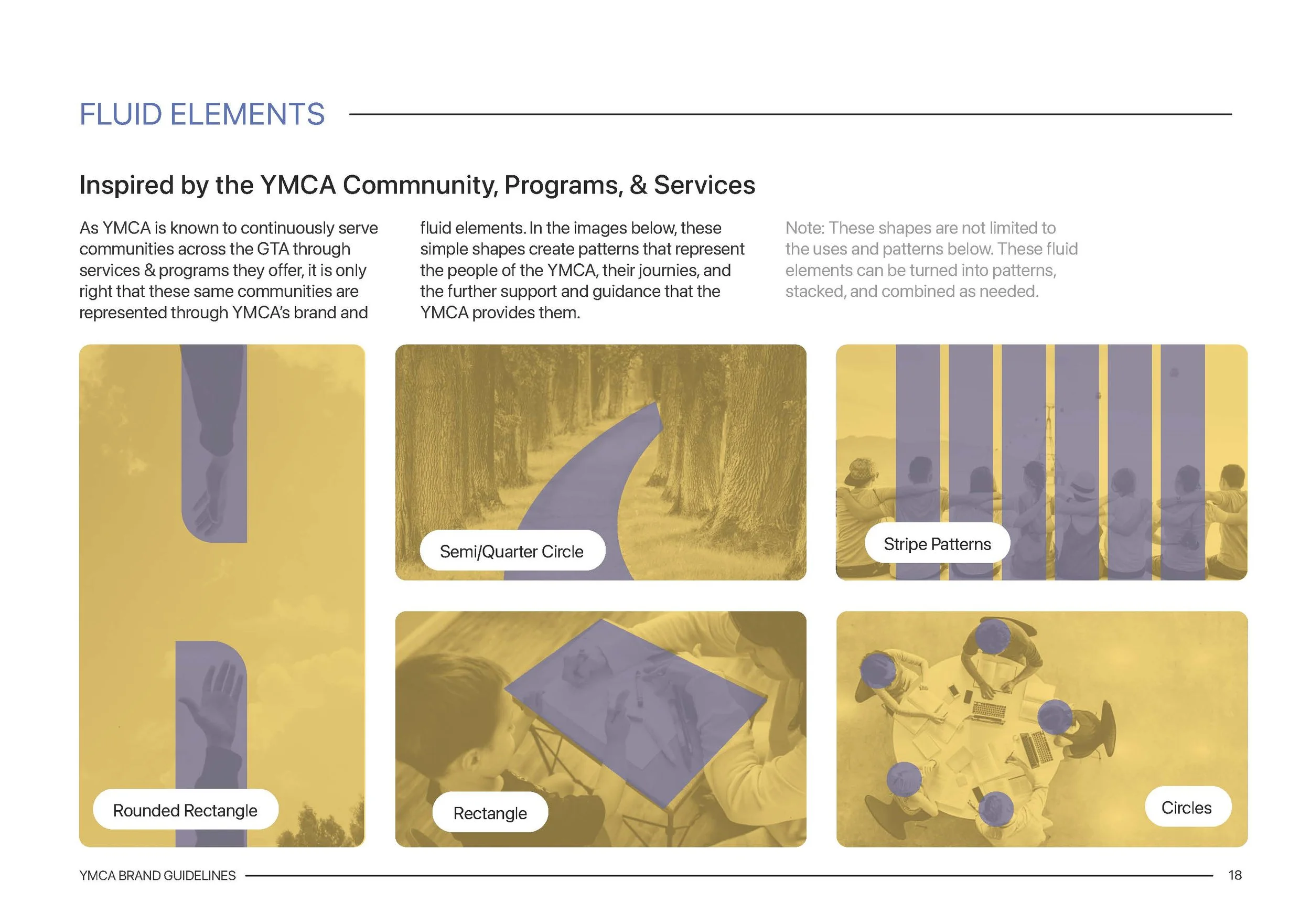
As YMCA is known to continuously serve communities across the GTA through services & programs they offer, it is only right that these same communities are represented through YMCA’s brand and fluid elements. In the images below, these simple shapes create patterns that represent the people of the YMCA, their journeys, and the further support and guidance that the YMCA provides them.
YMCA Proposed Fluid Elements
Iconography
In order to fully re-establish YMCA brand guidelines, YMCA Iconography was redesigned for the purpose of consistent signage and navigation all across YMCA organizations. Iconography is to be kept at one solid color & be accompanied by text.
YMCA redesigned iconography
Sample YMCA indoor sign using the redesigned iconography
Corporate Stationery
YMCA Business Card, Standard-size Envelopes, & Letterhead
Marketing Items
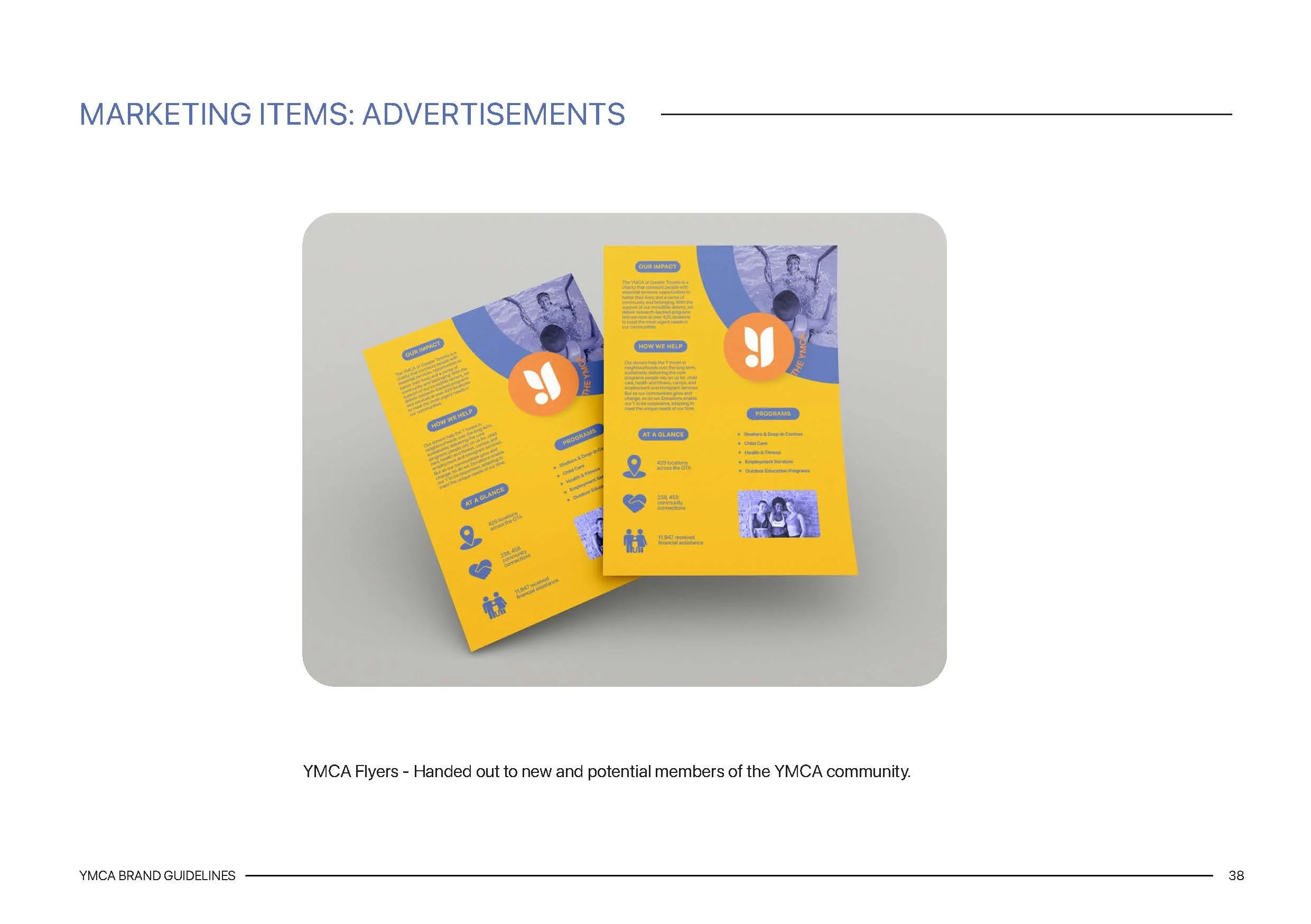
YMCA Flyer
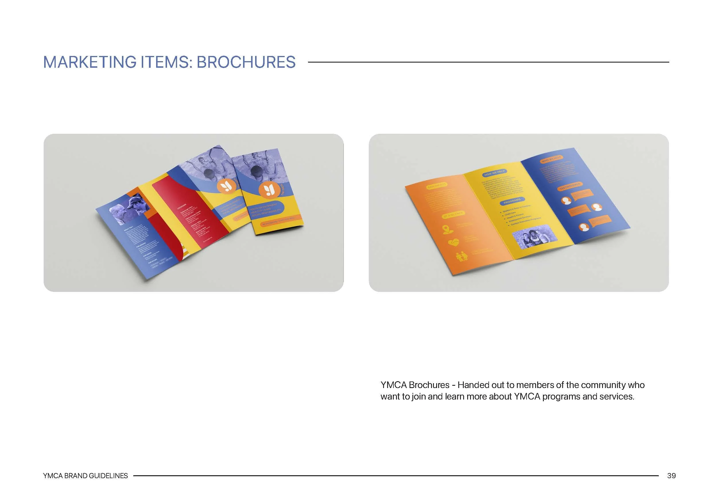
YMCA Tri-fold Brochure – Front
YMCA Tri-fold Brochure – Back
Merchandise
YMCA Waterbottles
YMCA Protein Powder
YMCA Gym Bag
Wearable Items
YMCA Staff Member Shirt
YMCA Member Card
YMCA Members Complimentary Lanyard


